Sapient Nitro
HSBC
2016

UI
To design a suite of innovative investment products for HSBC tailored for both sophisticated and novice investors.
By creating a product that allowed users to trade in funds, equities and bonds focusing as well on a journey for novice investors interested in any of HSBC’s “Structured Products”.
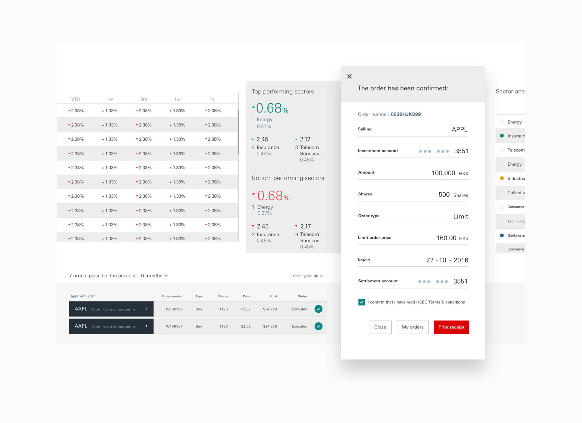
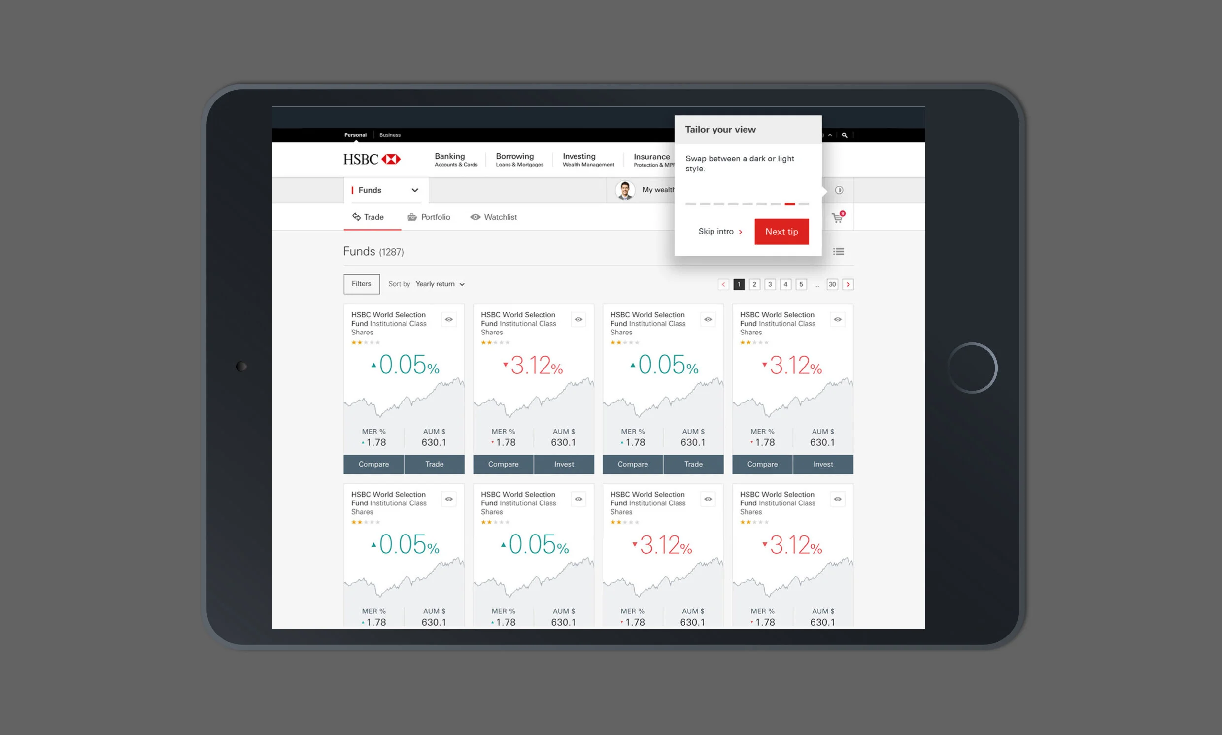
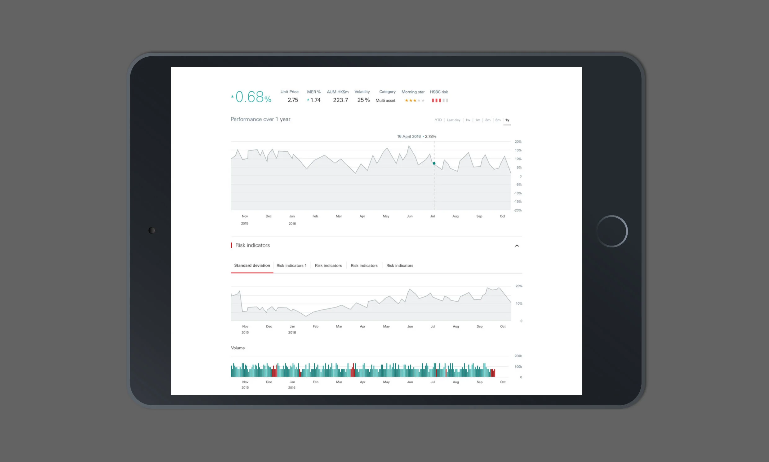
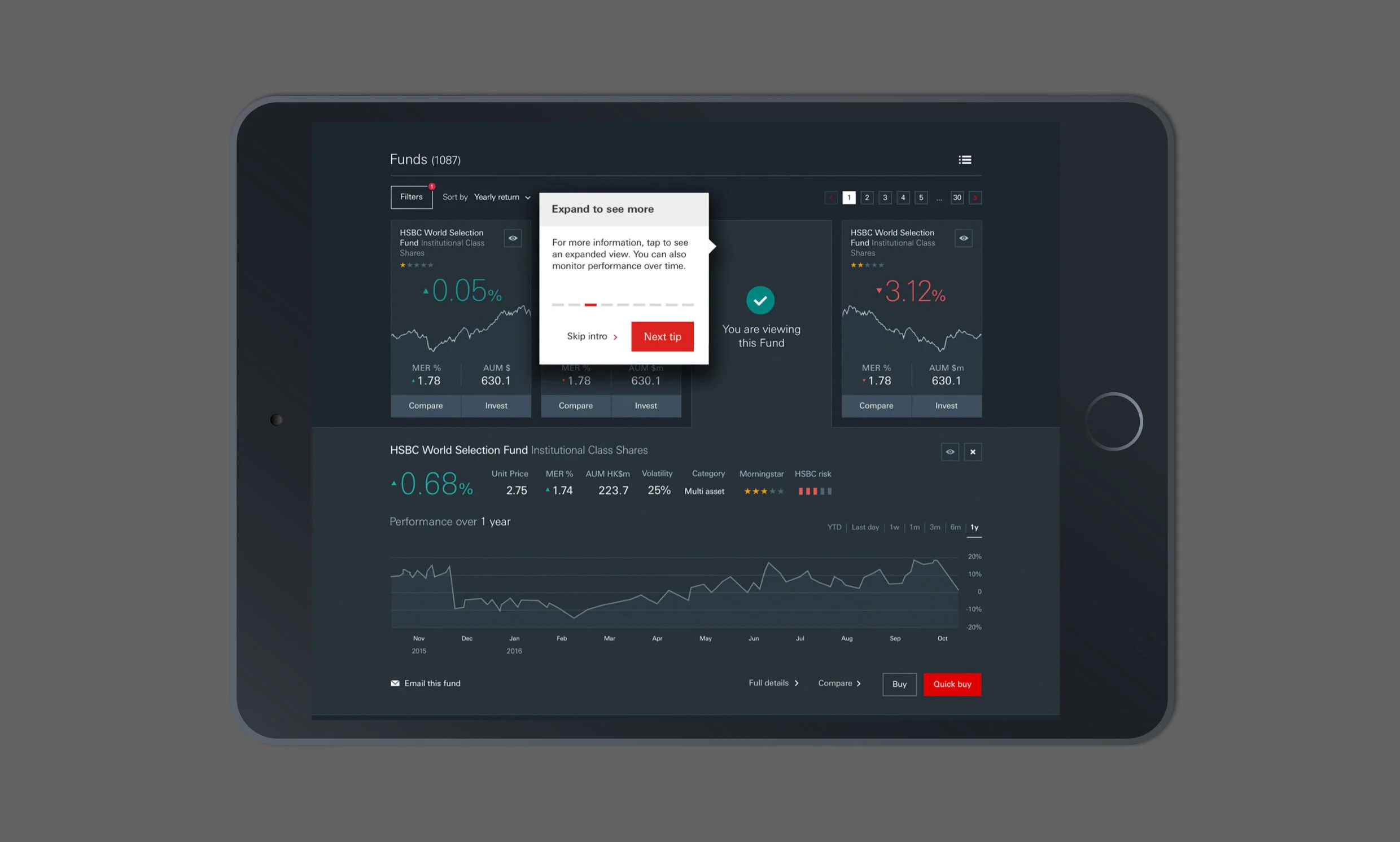
With a high amount of data visualisation to be shown on each screen and two different types of users.
Read additional info ↴
The HSBC Wealth Management project consisted of five main products - three aimed at expert traders and two for less expert users.
Based on long and short guided journeys into a more general and simpler way of investing as well as more complex trading applications for funds, equity and "Structured Products" - a simple and easy entry into the world of investment and financial products led by a simple set of questions that would identify the customers attitude towards risk but also tailored a product that suited the customers area of interest.
By working in a collaborative process where best ideas were developed into high-fidelity prototypes after research and wireframing done.
Through UX research sessions two types of users were identified - the novice who knows very little about investing but wants to try it out and the trader. We also discovered that traders fall into two camps: The fundamental trader - buy and sell stocks and funds based on their fundamental beliefs - and the technical trader - will trade a stock purely on the shape of certain graphs.
This meant that designing different graphs for the app was important. I worked closely with the client to design the graphs from an information point of view. I also worked closely with the VD crew to make sure the visuals captured this information. This involved a lot of rapid sketching:
As part of this project, we created an investment purposed website which required improvements on the data visualisation and Investor Profile Questionnaires.
The brand language for data visualisation made the reading easier and the most relevant data to stand out. By opting for a dark background, we made the content feel different to the rest of the website.
●
Associate Creative Director ○ Hiia Immonen
Manage Design ○ Sam Ladlow
Lead Design ○ Paul Newby
UX Design ○ Maria Turk